

Shape morphing in After Effects: the Apple-style UI animation, explained
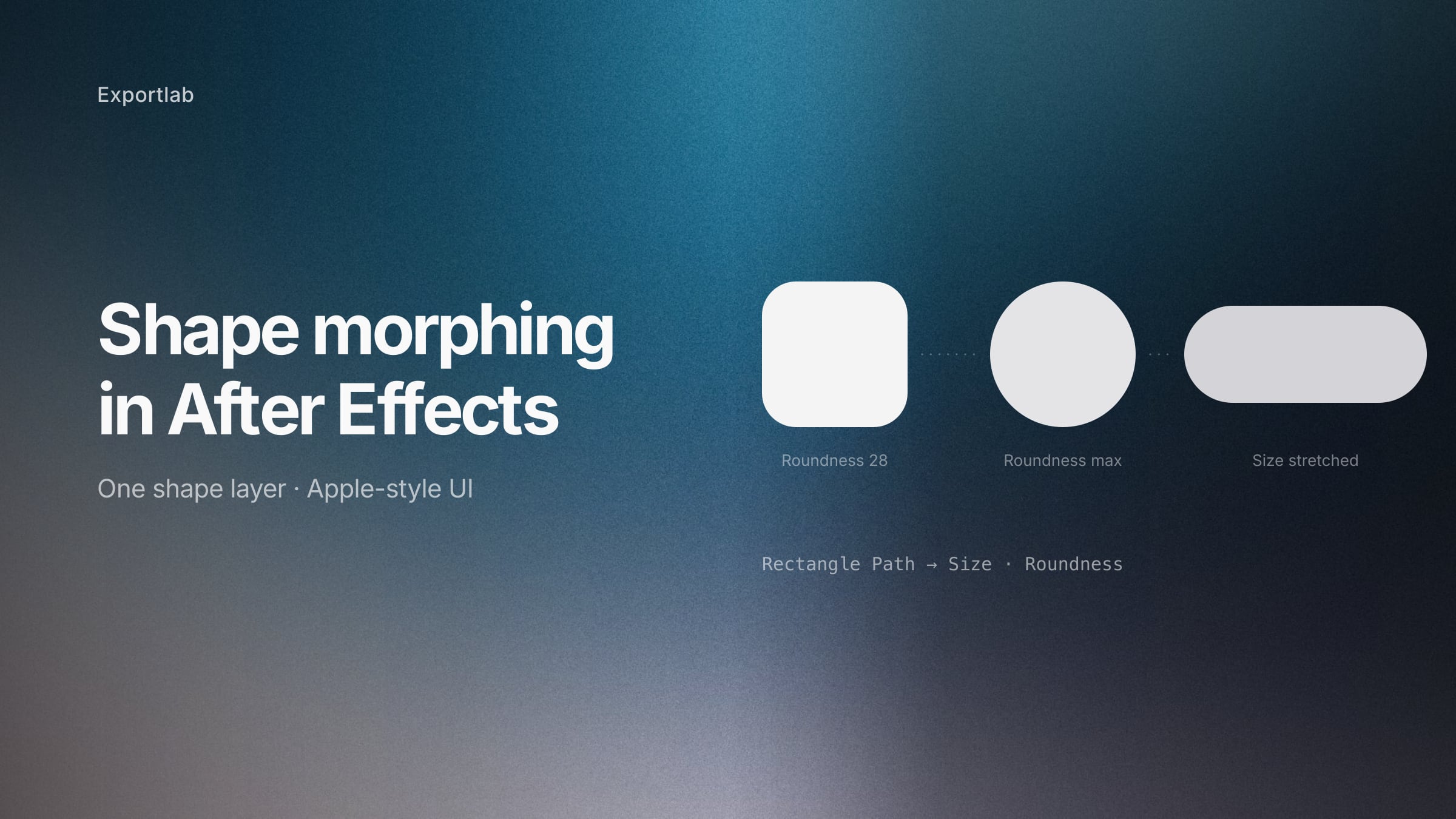
You have seen the animation: a square icon stretches into a search bar, the search bar rounds off into a button, the button becomes a card. It looks like a dozen elements handing off to each other. It is usually one shape layer.
That is the whole trick, and the reason these animations feel so smooth. Nothing appears or disappears — a single shape changes what it is. Everything else (icons, text, avatars) just fades on top.
The mechanics take about five minutes to learn. Almost everyone gets one thing wrong on the first attempt, so let us start there.
The mistake: using Scale
The instinct is to select the layer, press S, unlink the aspect ratio and keyframe the width. It looks like it works. It does not.
Scaling a rounded rectangle scales everything, including the corner radius. Stretch a 200×200 square with 40px corners out to 600×200 and the corners stretch with it — you get flattened, ovalised ends instead of the clean radius you started with. On an Apple-style UI animation, where the whole point is that corners stay consistent, that reads as broken.
The fix is to animate the path, not the layer. Open:
Shape Layer → Contents → Rectangle 1 → Rectangle Path 1There you find Size and Roundness as separate properties. Animate those and the corner radius stays exactly where you set it, no matter how far the shape stretches.
This video is loaded from YouTube. Nothing is sent to Google until you allow it.
The three properties that do everything
Once you are on the path instead of the layer, UI morphing comes down to three controls.
Size — width and height, with a link toggle between them. Click the chain icon to unlink, and you can stretch horizontally without touching the height. This is what turns a square into a pill, a card into a bar.
Roundness — the corner radius. Set it to zero and you have a square; raise it until it stops changing and you have a circle. This single property covers square → rounded square → circle, which is most of what UI morphing needs.
Fill → Color — keyframe it and the shape appears to become a different element. This is what sells the illusion more than anything: the shape changes proportions *and* colour at the same time, and the eye reads it as one component turning into another rather than a rectangle being resized.
A worked sequence: square → circle → pill
The order matters more than the values. This is the sequence most Apple-style UI animations are built from.
- Start square. Equal width and height, roundness around 20–30% of the side. Apple almost never uses hard 90° corners, so even the "square" state is slightly rounded.
- Keyframe all three properties at the start. Size, roundness, fill. Keyframing everything locks the state, so later changes cannot drift backwards into frames you already finished.
- Move 6–8 frames ahead. That is the working range for UI transitions — long enough to read, short enough to feel responsive. Slower than 12 frames and it starts to feel sluggish.
- Raise roundness to maximum. Now it is a circle.
- Move another 6–8 frames, unlink Size, stretch the width. The circle becomes a pill, and because roundness is already at its cap, the ends stay perfectly semicircular on their own.
Ease every keyframe (F9), then open the graph editor and pull the handles in. The default ease is too symmetrical for this — UI motion generally wants a fast start and a long settle.
This video is loaded from YouTube. Nothing is sent to Google until you allow it.
Bezier paths: when the shapes are not rectangles
The Rectangle Path method covers squares, circles, pills and cards — which is nearly all UI work. For arbitrary shapes, logos or icons, you need a different route.
Create both shapes, then for each one right-click the path and choose Convert To Bezier Path. Now keyframe the first shape's path, move ahead in the timeline, select the second shape's path keyframe, copy it, and paste it onto the first shape's path property.
After Effects interpolates between the two point sets. Then delete or hide the second shape — it was only there as a source.
Two things that decide whether this looks good:
Point count. After Effects matches points in order. If one shape has 4 points and the other 12, the interpolation has to invent a mapping and the result twists in ways nobody wants. Give both shapes the same number of points, ideally in the same order, before you morph.
Position drift. The shape often shifts slightly during the morph, because the paths have different centres. Fix it by keyframing Position alongside the path and re-centring at the end keyframe.
This video is loaded from YouTube. Nothing is sent to Google until you allow it.
What actually makes it look expensive
The morph itself is the easy part. Three things separate a technically correct morph from one that looks like Apple made it.
Motion blur, on every layer. This is the single most common omission. Toggle it per layer *and* enable the master switch in the timeline. Without it the shape teleports between frames; with it, the transition reads as physical movement. It costs nothing and changes everything.
A bounce on the size. Applying a bounce expression to Size gives the shape a slight overshoot as it settles, which is exactly the elastic quality Apple's own transitions have. We published the bounce expression we use with each parameter explained — for shape morphing, keep the amplitude low (around 0.02–0.04), since size overshoot is far more visible than position overshoot.
Staggered content. Icons and text should not appear at the same moment the shape finishes. Offset each element by one or two frames, so they cascade in. That one-frame stagger is the difference between "elements appeared" and "the interface responded".
Common problems
The corners distort. You are animating Scale instead of Rectangle Path → Size. This is the one everyone hits.
The shape jumps at the start of the morph. Some property was not keyframed at the beginning, so After Effects interpolates from wherever it was to the new value across the whole layer. Keyframe every property you intend to change, at the start, before you change anything.
The bezier morph twists. Mismatched point counts. Add points to the simpler shape until both match.
The transition looks stiff despite easing. Check that motion blur is actually on — both on the layer and the master switch — and pull the graph handles further in. Default easy ease is too gentle for UI work.
It looks fine in the viewport but wrong on export. Motion blur settings differ between preview and render. Check the composition's shutter angle before you deliver.
Where this is worth using
UI demo videos for an app or feature, product launch clips, and social posts where an interface has to explain itself in eight seconds. It reads as considered and expensive, which is precisely why Apple uses it — and why a single shape layer with three animated properties is such good value for the effort.
It is not worth it for anything with a real interface behind it. If the actual product exists, a screen recording is more honest and takes ten minutes.
FAQ: shape morphing in After Effects
How do I morph a shape in After Effects?
For rectangles and circles, animate Contents → Rectangle Path 1 → Size and Roundness rather than the layer's Scale. For arbitrary shapes, convert both paths to bezier, copy the target path keyframe and paste it onto the source path property.
Why do my corners get distorted when the shape morphs?
You are animating Scale, which scales the corner radius along with the shape. Animate Rectangle Path → Size instead — the radius then stays fixed at whatever roundness you set.
Do I need a plugin for shape morphing?
No. Everything here is native After Effects. Plugins like Flow or Bouncer speed up the easing workflow, but the morph itself needs nothing installed — which also means the project opens correctly on someone else's machine.
How do I turn a square into a circle?
Match the width and height in Size, then raise Roundness until it stops responding. It caps at half the shorter side, which is exactly a circle.
How long should a UI morph transition be?
Six to eight frames at 30 fps for most transitions. Under four frames it is too fast to read; beyond twelve it starts to feel sluggish. Interface motion should feel responsive rather than cinematic.
Why does my bezier morph twist and fold?
The two paths have different numbers of points, so After Effects has no clean mapping between them. Add points to the simpler shape until both have the same count, ideally in the same order.
What makes Apple-style animations look so smooth?
Three things beyond the morph itself: motion blur on every layer, a slight bounce as properties settle, and content staggered by one or two frames rather than appearing all at once.
What happens after the render
The animation is the visible part of the job. The rest is showing it to whoever commissioned it, getting notes that point at a specific frame instead of "the middle bit feels off", and having an approval you can refer back to. That is the half of the work Exportlab is built for — frame-accurate comments on the actual cut, in the same place the file gets delivered.